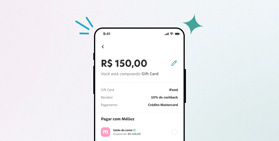
Enhancing Mobile Banking and Payments Usability
YEAR
Mid 2022
PLATFORM
Web
MY ROLE
Product Designer
Introduction
Méliuz was first introduced as Brazilian cashback platform that rewards users for online purchases. It operates as a browser extension or mobile app, tracking user shopping activities and offering cash back on eligible purchases. In 2022, Méliuz became a digital bank with a marketplace.
My Role
I'm was lead product designer for the payments squad, leading this and other projects. I collaborated with product managers, other squads and developers throughout this project.
Challenge
Méliuz faced challenges in providing a seamless mobile banking and payments experience for its users. Users were dissatisfied with the lack of integration between their Méliuz accounts and the payment process, limiting their ability to use their account balances for purchases.
PROBLEM #1
Limited Payment Options
Users could not use their Méliuz account balance for purchases, forcing them to transfer funds to other banks.
Example
A user wants to buy a gift card on Méliuz marketplace using their account balance. However, they cannot do so and must first transfer funds to another bank account to use PIX or a credit card. This extra step creates inconvenience and frustration for the user.
Impact
The limited payment options can lead to users abandoning their purchases, resulting in lost sales for Méliuz. Additionally, it may discourage users from using their Méliuz accounts for everyday transactions, limiting the bank's potential revenue.
PROBLEM #2
Inconsistent Experience
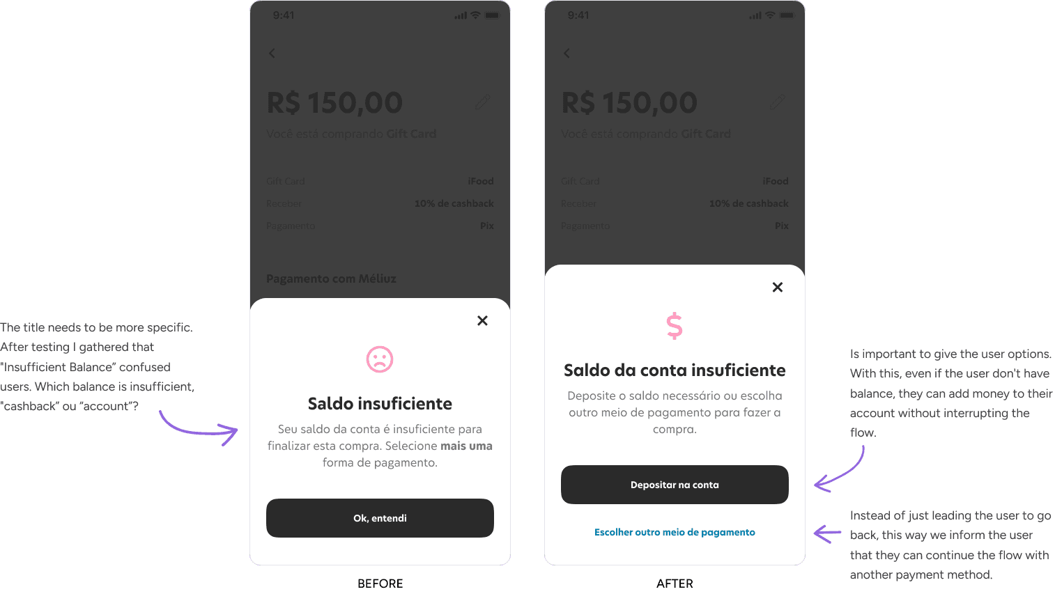
The payment process did not align with users' expectations, leading to confusion and frustration.
Example
A user is familiar with the payment process on other apps but finds the Méliuz checkout experience confusing and difficult to navigate. They struggle to find the option to use their account balance or add a new payment method.
Impact
An inconsistent experience can lead to user frustration and dissatisfaction. It may also increase the likelihood of user errors and abandoned purchases, negatively impacting Méliuz's conversion rates and reputation.
How can I redesign Méliuz's checkout experience to make it more user-friendly and increase customer satisfaction?
Goals
Increase User Satisfaction
Elevate user satisfaction with the mobile banking and payments experience by simplifying the checkout process and reducing friction points.
Improve Conversion Rates
Optimize the checkout experience to increase the percentage of users who successfully complete their purchases.
Enhance Payment Flexibility
Empower users to seamlessly use their Méliuz account balance for purchases and easily manage their payment methods.
My Design Process
🔎
#1
💡
#2
⚒️
#3
📊
#4
🤝
#5
Design Sprints
We held design sprints to foster cross-functional collaboration within our company, involving Product Designers, Product Managers, Developers, and UX Researchers. Our aim was to create a significantly better user experience than what they were accustomed to. Since the checkout is one of the final steps in the purchase flow within our app, I had multiple design critiques and discussions with other designers leading different squads, such as shopping, account, credit card, etc. This collaboration ensured that the checkout experience was consistent with the rest of the app and aligned with broader user goals.
Research
After analyzing the data from a few financial services researches to understand the principles that guide the user, motivations, and feelings, I gathered a few valuable insights for this project.
RESEARCH FINDINGS #1
60.3%
of users make purchases online quite often.
RESEARCH FINDINGS #2
46%
of users use online services such as delivery, travel, and education.
RESEARCH FINDINGS #2
44.9%
of users have cashback as one of their decisions to purchase.
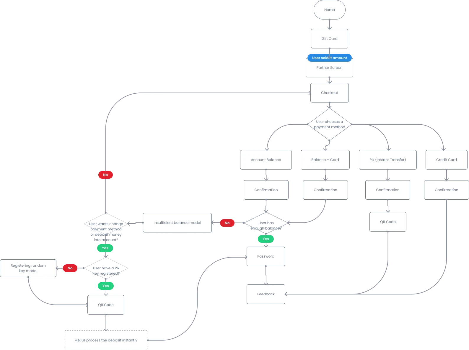
User Flows
We mapped user journeys and flows so the designs would be straightforward and intuitive, focusing on providing easy access to the most important information and functionality.
Below you can check high-level and samples of the process.
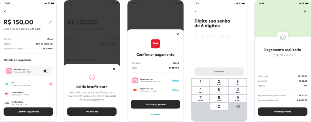
Early Designs
A sneak peek into my early designs and drafts. The designs have went through multiple iterations per screen. It is due to different reasons like change in business direction, shift in product roadmap, user testing or to improve the user experience.
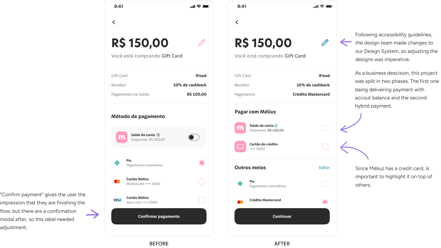
Final Designs
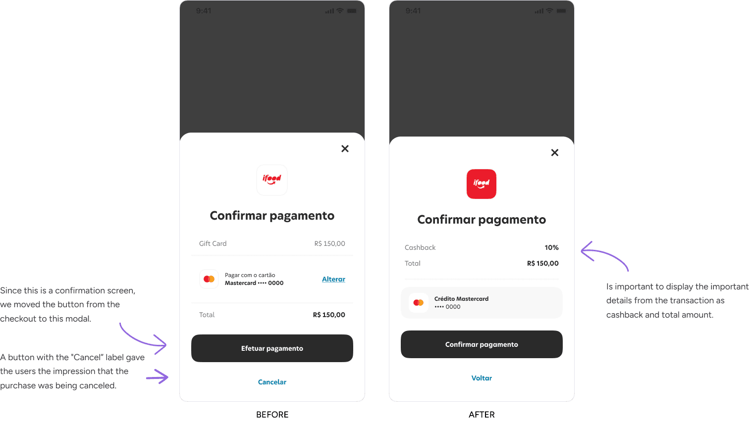
I went through multiple iterations. The initial designs went through several tests, discussions with development and operations teams to ensure we have a scalable user experience.
Here's a glimpse into the platform's design, incorporating our design library's typography, color palette, UI elements, and other components.
Key Results
The new checkout was implemented in June 2022, and for 3 months, I measured the performance of this service.
KEY RESULT #1
15.3%
Increase of users buying cellphone minutes.
KEY RESULT #2
9.4%
Decrease of users abandoning the purchase at the checkout.
Looking to start a project or you need
consultation? Feel free to contact me.
